

Reikiflo – Virtual Wellness Website Redesign
Reikiflo is a virtual reiki practice started during the pandemic by my friend. The goal of the business is focused on making energy healing more accessible and affordable. The existing website was not effectively converting new visitors or supporting repeat bookings.
I led the end-to-end UX/UI process, including competitive analysis, user research, persona development, user flows, information architecture, wireframes, visual design, and usability testing for the website redesign.

The Problem:
As demand for virtual wellness services increased, Reikiflo needed a redesigned website that could build trust with first-time clients unfamiliar with reiki practice, while providing returning clients with a clear and efficient path to book follow-up sessions.
The Goal:
To understand what people look for when booking a wellness appointment online, and use those insights to design a website that is both informative and true to the Reikiflo brand.
To understand where Reikiflo sits within the health and wellness space, I conducted a competitive analysis on the three major mental health platforms — evaluating similar services and auditing the usability strengths and weaknesses of their websites. This step of the process helped me identify the target users and support design decisions during the ideation stage.
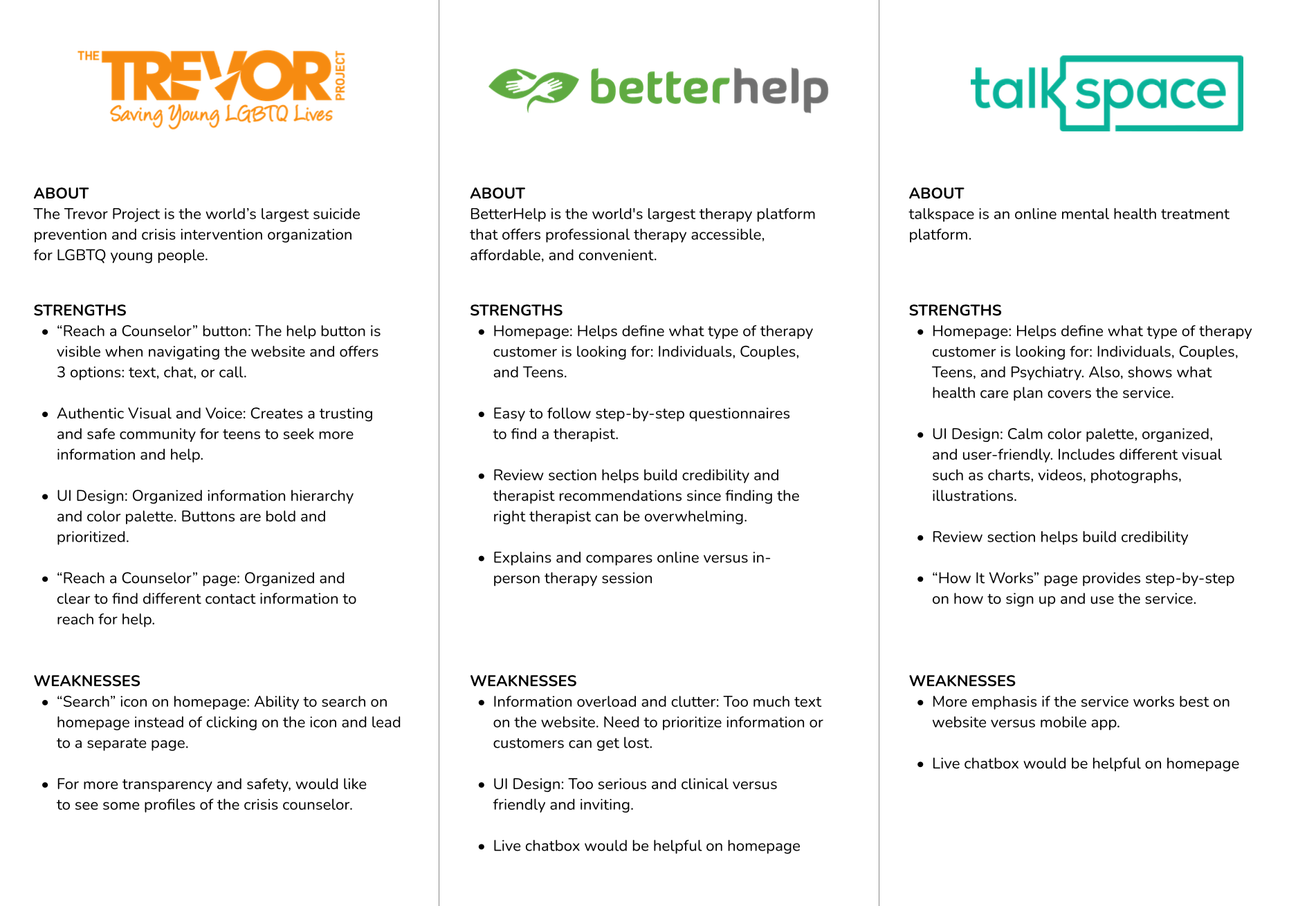
Patterns
• Homepage: Information is clearly presented and easy for users to find the different types of service provided.
• Reviews from real clients help build credibility and reassurance.
With a clearer picture of the market landscape, I shifted focus to the people Reikiflo is designed to serve. I interviewed seven potential users via Zoom (participants ages 25 to 35), to understand their motivations and frustrations when trying a new health practice and booking appointments online.
Motivations:
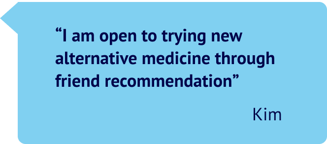
• Friend recommendations
• Practitioner’s credentials and experience
• Direct benefits, how it works, side effects
• Book appointments online
• Client testimonials
Frustrations:
• Cost
• Unfamiliar medical term
• Keep routine in order to be effective
• Appointment availability
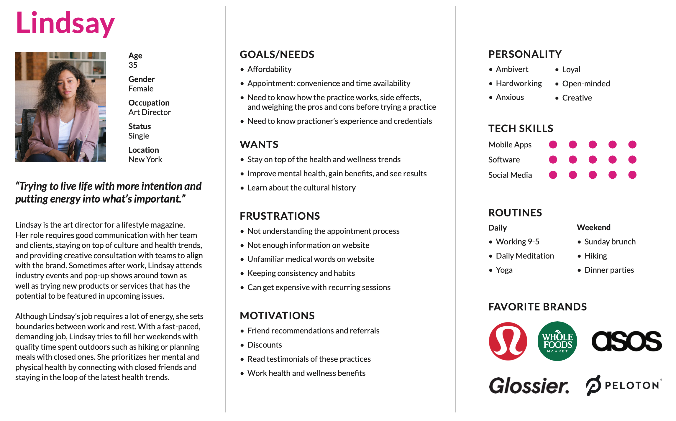
After identifying the pain points, I created an ideal client for Reikiflo.
Meet Lindsay — with a busy lifestyle, she prioritizes personal growth and mental health. I thought about what Lindsay’s goals, wants, frustrations, and motivations might be when trying a new health practice as well as what her user flow would be when navigating the actual site.
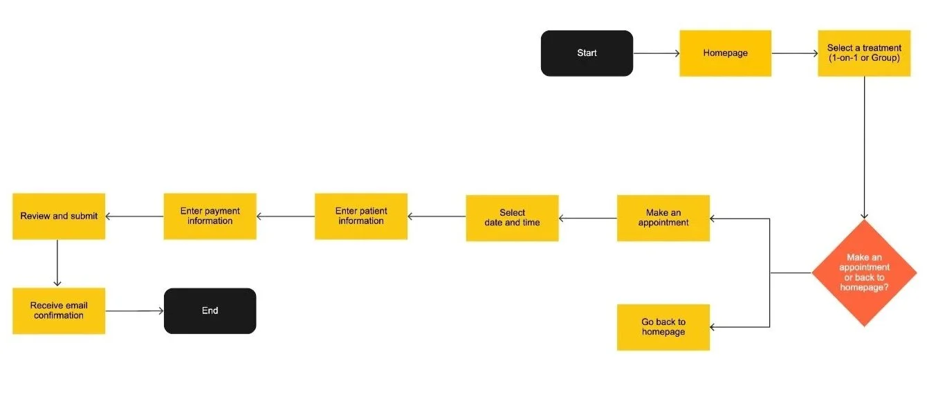
Scenario 1:
Making an appointment for a new patient
Lindsay's friend sees an Instagram post about reikiflo and shares the post with her. Lindsay is curious and browse the website, learns about the practice and the practitioner, and reviews the treatment offerings. She wants to try and decides to book a 1-on-1 session.
Scenario 2:
Making appointment for recurring patient
Lindsay enjoyed her first 1-on-1 session and is excited to book a follow-up.
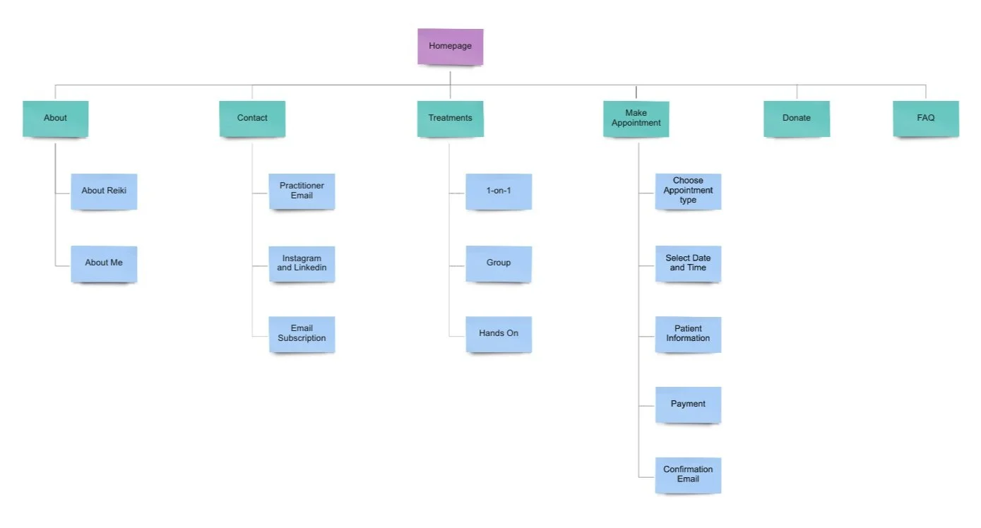
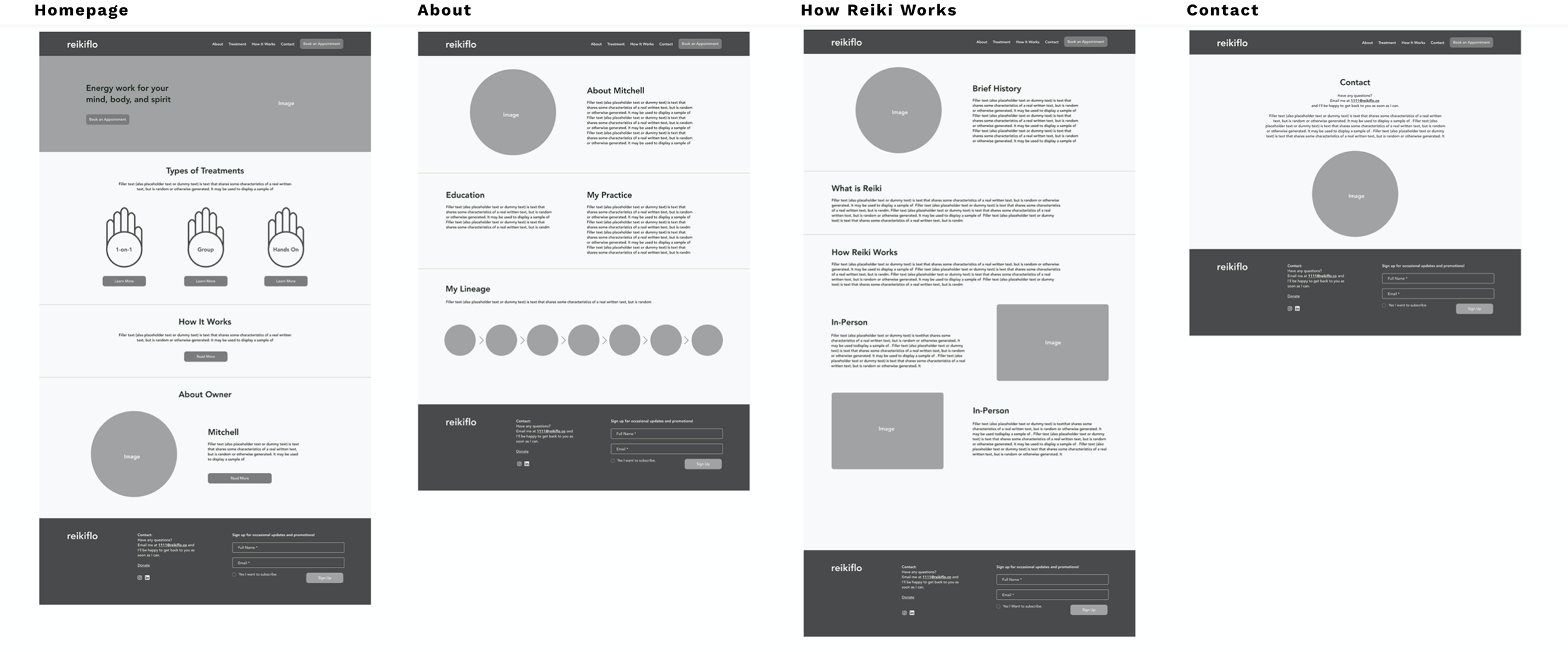
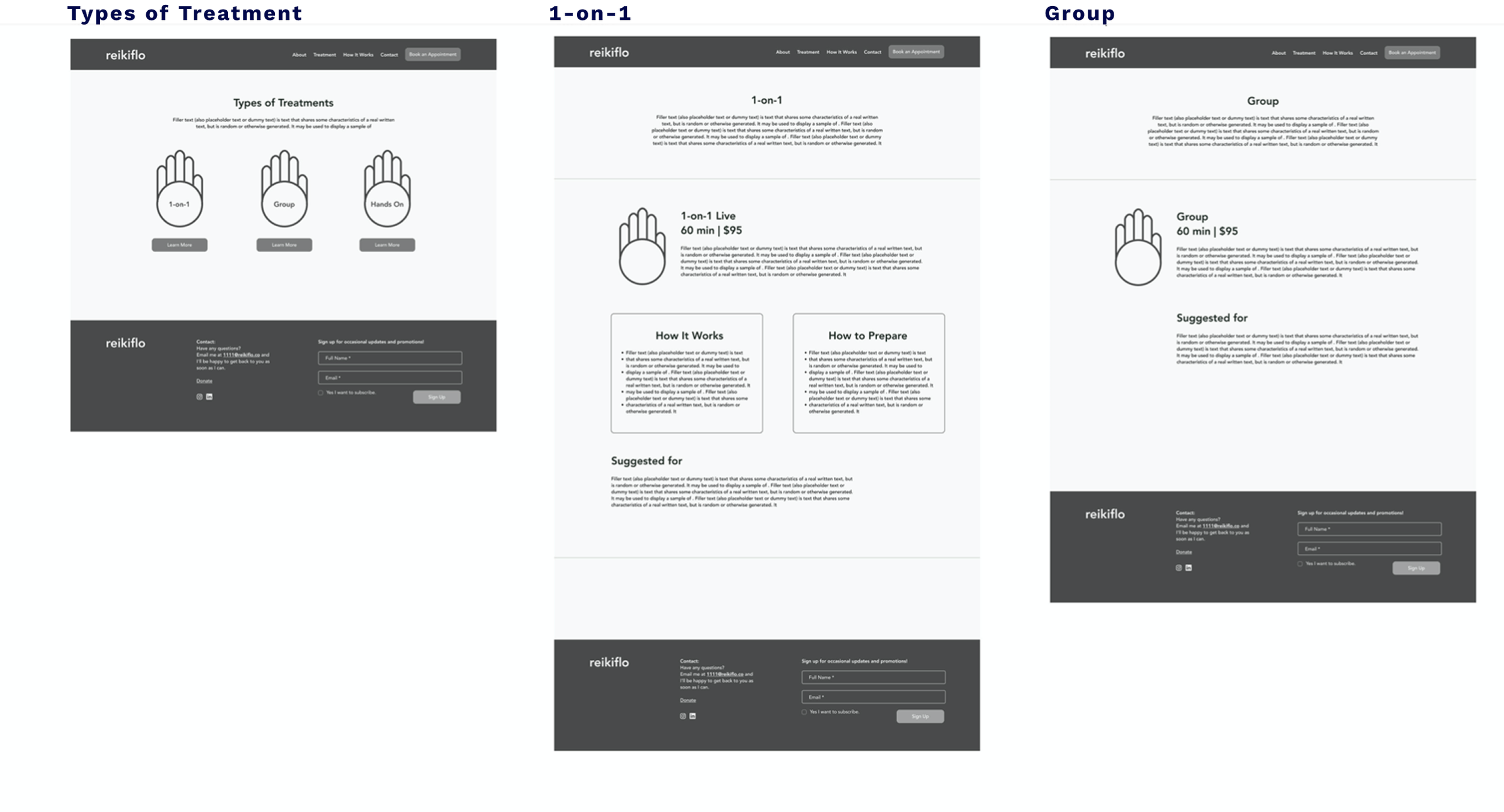
The information architecture for the website includes: Homepage, About, and Types of Treatments.
The About pages introduces the reiki practitioner and history of reiki. The Treatment page offers two types of virtual sessions (1-on-1 and group).
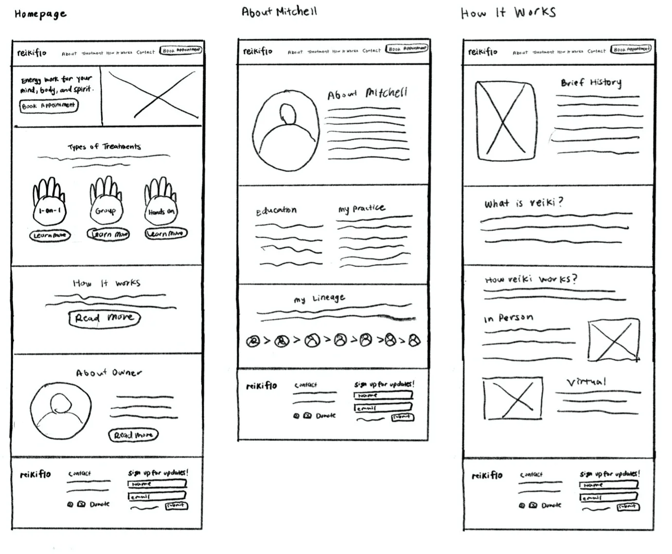
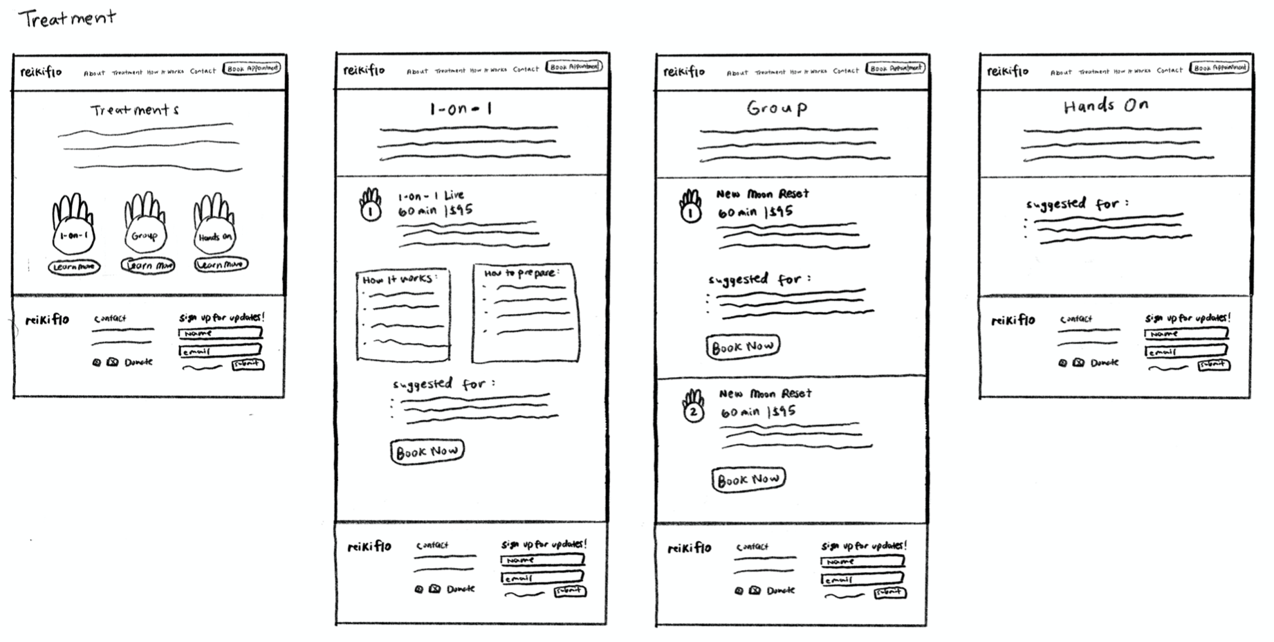
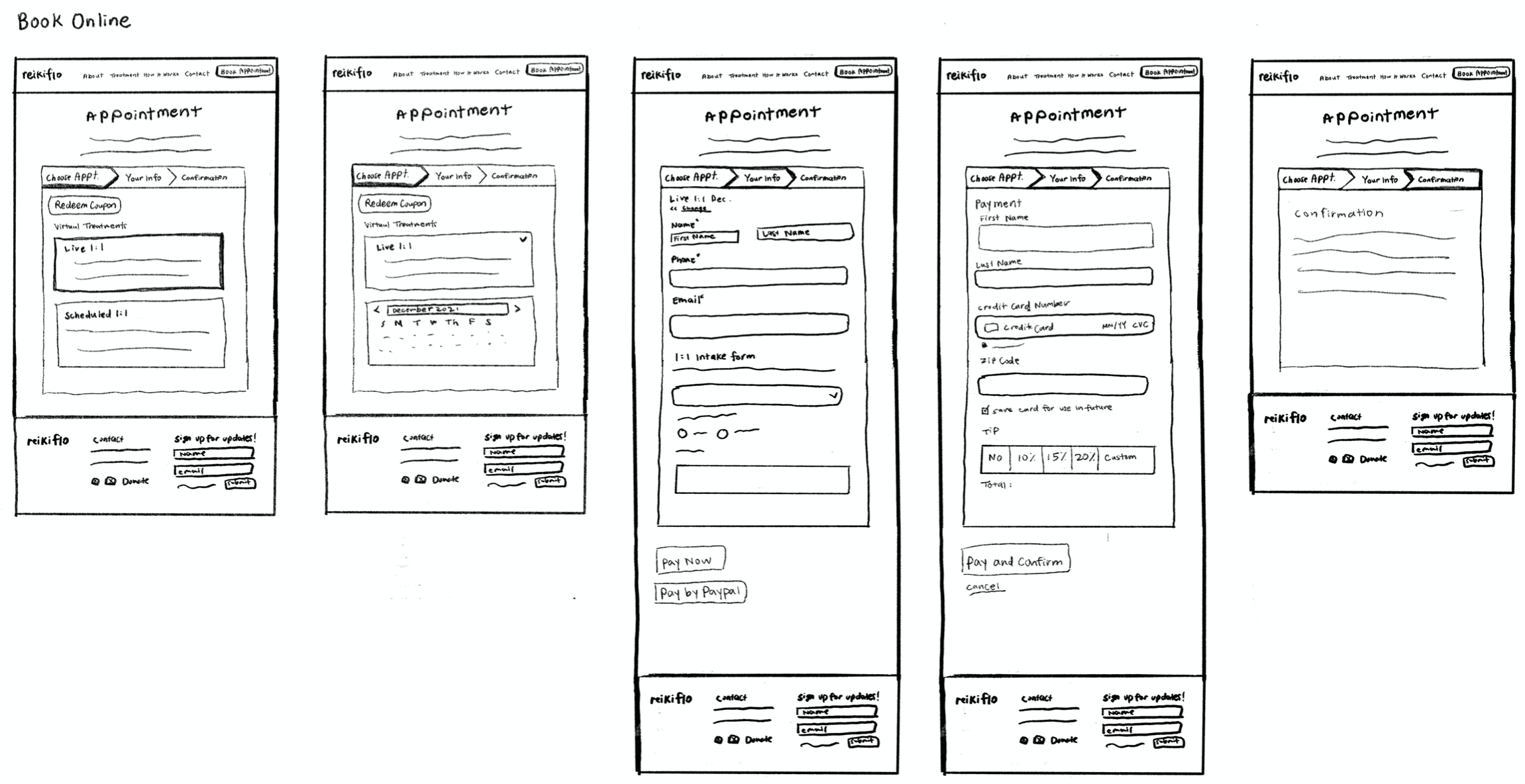
Wireframe Sketches
• Homepage focuses on a general overview of the service.
• About Owner and History of Reiki pages are informational so adding more images help break down context heavy sections and improve engagement.
• Treatment page is visually organized by the different treatments types (1-on-1 and group) by incorporating the hand icon from the logo.
• Also, after speaking with the client, the booking appointment system will be outsourced and integrated with another platform, Squarespace checkout.
• Website is built on Wix, so while sketching also keeping in mind of the limitations for the actual build.
Low-Fidelity Sketches
Style Guide
Drawing from market research and client conversations, I developed a design system rooted in the energy and fluidity of reiki practice. The color palette is calm and grounding, inspired by natural elements and the open sky.
The hand symbol references the energy points of the palm—a nod to the healing intention at the core of the practice.
Usability Testing
After designing the interface, I conducted a remote usability test to observe and understand how participants navigate the site in order to book an appointment. For this particular test, the users are first time customer new to reiki practice and want to book a group session.
Test Goals
• How users easily complete a task
• Overall quality and flow
• Observe any frustrations
• Discover any user patterns
Participants: Ages: 25-35
• Open to trying self-care rituals
• Interest in reiki
• Book appointments online
Overall, the client was happy with the website redesign hand-off because it aligned with his envision for the brand in the health and wellness industry as well as communicated with the mission.
Plan for next steps:
• Continue to communicate with client
(upcoming site updates, maintenance, technical help)
• Walking through design decisions before implementations